The No-BS Engineering Dashboard for Early-Stage Startups
You’ve just hit 15 engineers. The product is finding market fit, the codebase is growing faster than your test coverage, and your CEO just Slack’d you: “Hey, we need better visibility. Can we get an engineering dashboard going?”
Your first instinct might be to panic-buy an expensive analytics tool, integrate Jira with Tableau, and start tracking every single commit, PR, and story point.
Don’t do it.
For an early-stage startup (anywhere from 5 to 50 engineers), resist the temptation to build a comprehensive measurement system. At this stage, your biggest risks aren’t a lack of data. Your biggest risks are:
- Optimizing for metrics instead of customer value.
- Creating a bureaucratic nightmare of reporting overhead.
- Measuring things you can’t actually act on yet.
You don’t need a 40-chart command center. A tightly curated set of 6–8 metrics that balance speed, quality, developer experience, and business impact is all you need to keep the ship on course.
Here is the anti-bureaucracy, high-impact framework for measuring early-stage engineering.
1. Delivery (The DORA subset)
These metrics tell you one simple thing: Are we able to move quickly?
We’re going to borrow from the industry-standard DORA metrics, but we’re going to cherry-pick.
| Metric | Why it matters |
|---|---|
| Lead time for changes | How quickly does an idea actually reach production? |
| Deployment frequency | Indicates your delivery cadence. Are you shipping in massive, risky batches, or small, iterative chunks? |
| Change failure rate | The ultimate counterbalance. Ensures your speed isn’t actively destroying product quality. |
Notice what’s missing? MTTR (Mean Time to Recovery). Skip it. Unless you’re operating a massive production service with severe customer impact, it won’t provide much actionable insight right now. If incidents are still relatively rare, MTTR is just statistical noise.
2. Quality
DORA is great, but it doesn’t directly measure if your product actually sucks to use. You need a reality check.
Pick one or two metrics that are incredibly easy to understand and practically impossible to game:
- Escaped defects (bugs found by your customers before you found them)
- Production incidents per month
- Customer-reported issues
Keep it brutal, keep it honest.
3. Developer Experience (DevEx)
Please do not over-instrument this. You don’t need spyware to know if your devs are happy.
A simple, monthly pulse survey via Slack or email is surprisingly effective. Just ask them to rate this statement from 1 to 5:
“I can get changes from idea to production without unnecessary friction.”
Follow it up with three binary (Yes/No) questions:
- Do you have the tools you need?
- Are you frequently blocked?
- Can you stay focused without excessive interruptions?
A two-minute survey will reveal bottlenecks, broken CI pipelines, and meeting-overload long before a dashboard ever will.
4. Product Impact
This is where 90% of engineering dashboards fall flat.
Engineering cannot exist in a vacuum. Shipping a massive feature flawlessly and on time is a failure if nobody uses it. Engineering metrics must connect to business outcomes:
- Feature adoption
- Weekly active users (WAU)
- Trial-to-paid conversion
- Revenue from new features
- Customer retention
Without this layer, it is dangerously easy for an engineering team to celebrate shipping code that doesn’t actually create any value. Outcomes over output, always.
5. Business Impact
Connecting engineering effort directly to business outcomes is where engineering leaders transition from managing a cost center to driving strategic value. You must be able to answer: Is our engineering effort actually moving top-line revenue, reducing operational expenses, or multiplying organizational efficiency?
Engineering investments typically drive business impact across key operational categories:
| Category | Business Impact | Engineering Examples |
|---|---|---|
| Revenue generation | Directly increases sales | E-commerce, pricing optimization, recommendation engines, lead generation |
| Workflow automation | Increases productivity | Invoice processing, document automation, RPA, AI agents |
| Decision intelligence | Improves business decisions | Dashboards, forecasting, BI, executive reporting |
| Customer experience | Improves retention and satisfaction | Customer portals, chatbots, self-service, onboarding |
| Sales enablement | Helps sales close deals | CRM enhancements, proposal automation, CPQ |
| Marketing technology | Acquires customers efficiently | Attribution, campaign optimization, personalization |
| Financial operations | Saves money and reduces errors | Accounting automation, expense management, budgeting |
| Risk & compliance | Avoids fines and operational risk | Audit trails, security monitoring, compliance reporting |
| Supply chain & logistics | Optimizes operations | Inventory management, route optimization, demand planning |
| Developer productivity | Multiplies engineering output | CI/CD, internal platforms, AI coding assistants |
Do measure:
- Capacity Allocation vs. Strategic Priorities: Track the percentage of engineering capacity spent on revenue generation vs. cost reduction vs. platform/tech debt.
- Outcome Impact per Initiative: Connect major engineering bets directly to business metrics (e.g., ARR expansion, churn reduction, document automation).
- Time-to-Value for Strategic Bets: Measure how quickly an engineering investment moves from resource allocation to measurable business return.
Do NOT measure:
- “Story points or feature count as business value”
- Estimated ROI in isolation without cross-functional input from Product, Sales, or Finance
Measuring features shipped without tracking their business return creates a false sense of productivity. Engineering effort is a finite financial investment—make sure it’s driving measurable business outcomes.
The Founder’s Dashboard
If I were setting up an engineering dashboard for a Series A startup tomorrow, it would look something like this:
| Area | Metric |
|---|---|
| Delivery | Lead time |
| Delivery | Deployments per week |
| Reliability | Change failure rate |
| Quality | Customer-reported bugs |
| Customer | Feature adoption |
| Customer | Active users or retention |
| Team | Monthly developer experience score (1-5) |
| Business Impact | Effort allocation & strategic outcome impact |
That’s it. It’s enough to spot trends, celebrate wins, and catch systemic issues without overwhelming the team with data-entry chores.
The “Avoid” List
Some metrics sound fantastic in a boardroom but are actively toxic to engineering culture. They incentivize the wrong behaviors, encourage gaming the system, and destroy morale.
Avoid these at all costs:
- ❌ Story points completed / Velocity (capacity planning tools, not performance metrics)
- ❌ Lines of code
- ❌ Number of commits
- ❌ Pull requests per engineer
- ❌ Hours worked / Time online
- ❌ Features shipped count (without usage or outcome tracking)
- ❌ Ranking engineers by output
These are activity metrics, not outcome metrics. Measure these, and your developers will happily write shorter, messier PRs, commit every 10 minutes, and write verbose code just to make the chart go up to the right.
The Golden Ratio
If you’re going to take one practical principle away from this for your early-stage startup, use this rule of thumb:
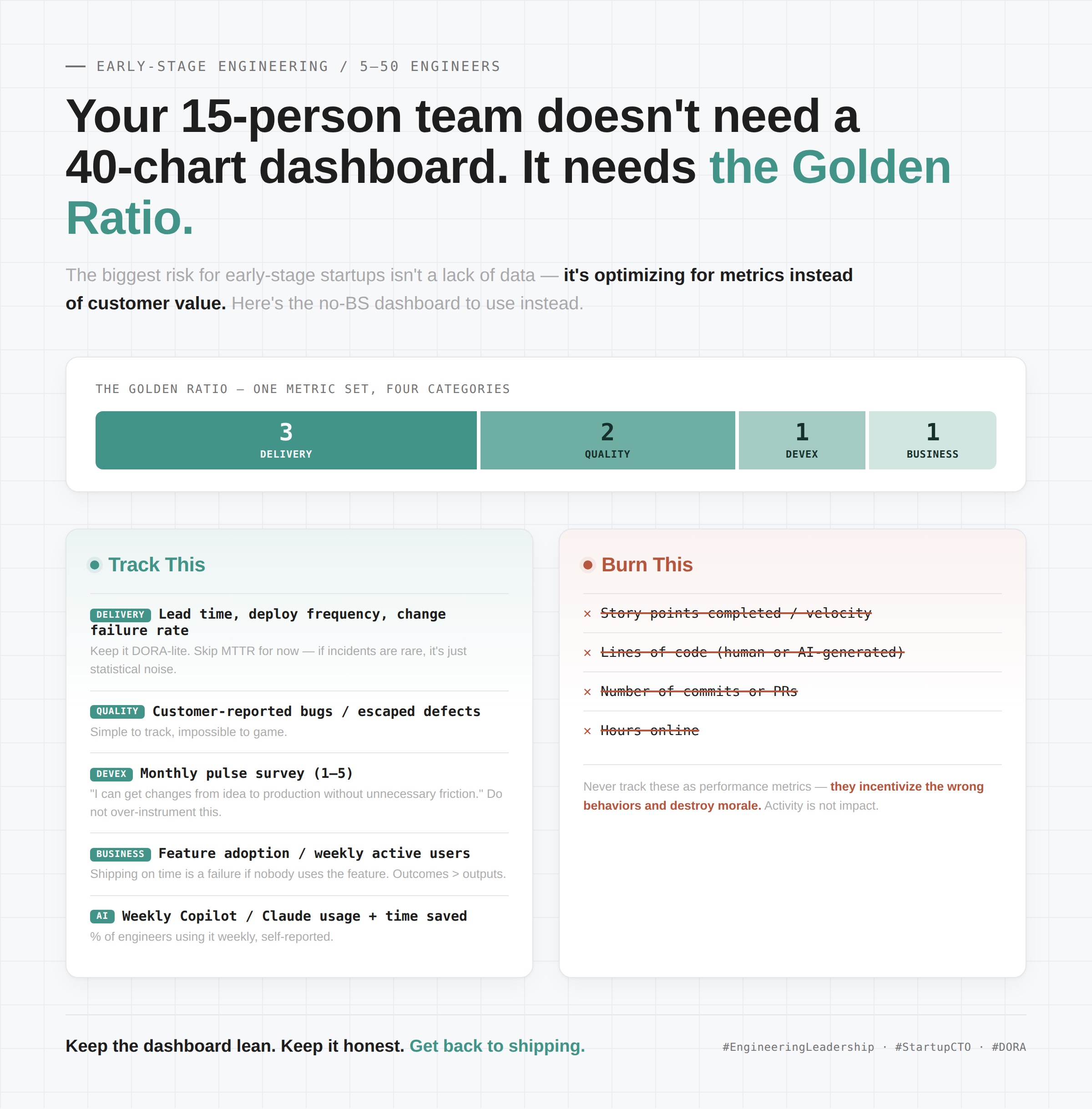
Three delivery metrics, two quality metrics, one developer experience metric, and one business outcome metric. (3:2:1:1)
That gives you a perfectly balanced view while keeping the system simple enough to actually review in a 30-minute weekly leadership meeting.
As the company grows and you cross the 50–100 engineer threshold, you can absolutely expand into a richer scorecard with more detailed DevEx, reliability, and strategic business impact measures. But until then? Keep it lean, keep it honest, and get back to shipping.